
Introduction: An Analog Heart in a Digital World
Before I ever picked up a digital camera, I fell in love with photography through film. There was something unmistakably magical about those rolls of Kodak and Fuji — the patience it demanded, the mystery of not knowing what you’d captured until much later, and the slow, almost meditative process of working in a darkroom or waiting for scans to arrive. Back then, “post-processing” didn’t mean sliders and masks. It was chemical baths, paper choices, and dodging and burning under the red light.
Even now, years into the digital age, I still carry the mindset of a film photographer with me into every wedding. My work is shaped by that analog philosophy: the belief that photography is not just about the click of a shutter, but about the transformation that happens afterward. In many ways, editing — or post-processing — is where the photograph truly becomes mine.


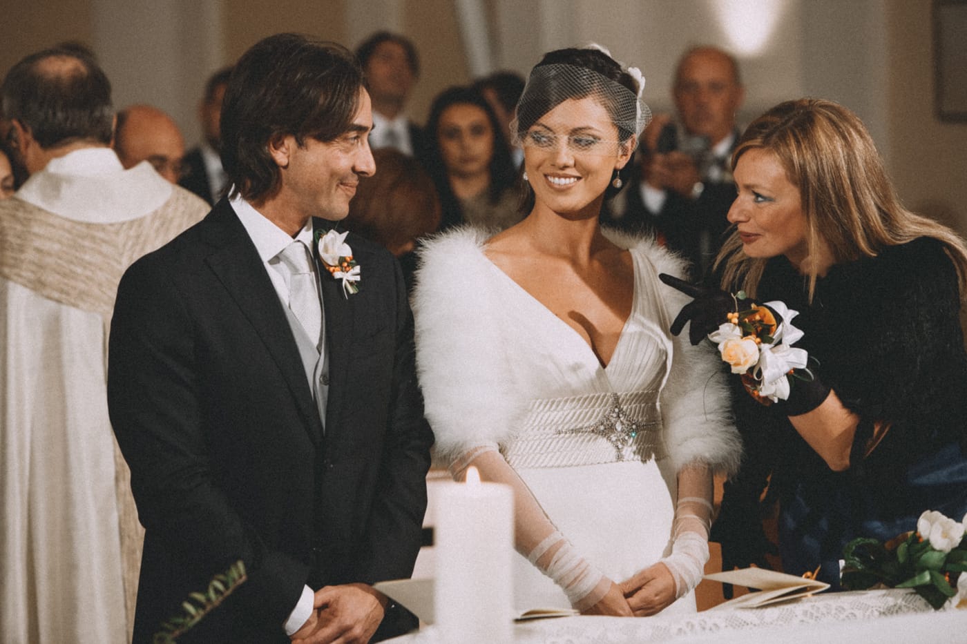
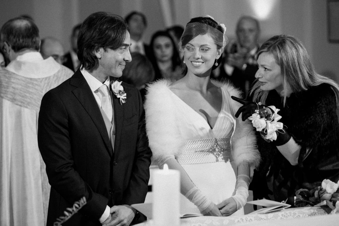
In this before-and-after comparison, you'll notice how the highlight compression in the sky preserves detail without affecting the overall image luminosity. This characteristic mimics film stock, which is naturally forgiving on clipped highlights and maintains pleasing tonal range.
The skin tones have been refined by removing excessive red saturation for a more natural, flattering appearance. The distracting figure on the right has been removed to improve composition and focus on the main subjects.
The image's inherent warmth and atmosphere have been preserved and subtly enhanced, maintaining the authentic mood while elevating visual impact. The slightly reduced dynamic range – typical of film stocks, enhances the romantic mood.
Film emulation: Kodak Portra
Why Wedding Photography Post-Processing is Essential
Let’s start with something fundamental: a RAW file is not a finished photograph. If you’re not a photographer, think of RAW files like the ingredients to a recipe. They’re not meant to be consumed as-is — they’re bland, flat, and unfinished. JPEGs, on the other hand, are like microwave dinners: pre-packaged, convenient, but limited in flexibility and flavor. When I shoot in RAW, I do it because I want full control over every element — the contrast, the colors, the tones, and especially the mood.
Editing gives me the ability to honor the feeling of a moment. The golden light at sunset, the intimacy of a quiet look, the electricity on a crowded dance floor — those moments don’t always translate directly into camera. Sometimes, the sensor captures reality too clinically. My job in post-production is to reintroduce the emotion, to shape the image until it resonates with the atmosphere I felt when I took it.
The Transformative Power of Post-Production
I’ve seen it time and time again: a photo that looks “fine” in camera becomes something extraordinary in post. There’s a particular shot I remember from a destination wedding I shot in Fidenza — a candid moment of the bride adjusting her eyelash in the mirror. In camera, it was dull, flat, and lacking contrast. But in Lightroom, I slightly adjusted the tone curve, darken the shadows just enough to reveal the softness in her expression, and brought in the warmth of film stock emulation that echoed the sunlight coming through the window. Suddenly, the image transformed into something cinematic, intimate, alive.
Film emulation: Agfa Ultra


This candid shot perfectly demonstrates how thoughtful post-processing can transform an ordinary capture into cinematic art. The original image straight from camera appeared flat and lifeless, lacking the depth and emotion present in the actual moment.
I began with subtle tone curve adjustments to create gentle contrast while maintaining natural skin tones. The shadows were darkened to add dimension and reveal the delicate softness in the bride's expression.
Film stock emulation brought warm and cinematic color grading that enhanced the natural sunlight streaming through the window, while balanced highlight and shadow work created depth without losing facial detail.
Post-processing can be subtle or dramatic, but it should always serve the story. It’s not about faking a moment or deceiving the viewer. It’s about deepening the image, enhancing what’s already there, and honoring the memory in a way that feels authentic and emotionally true. Put it simple: Post-processing doesn’t fabricate emotion. It reveals it.
Post-Processing as an Art Form: My Approach
Editing is more than a technical chore — it’s an extension of my artistic voice. The choices I make in post-production — how much contrast to use, what tones to emphasize, when to mute or saturate — all contribute to the emotional texture of the image. It’s where the photograph stops being documentation and starts being art.
I edit intuitively, guided by how I felt in the moment and how I want my couples to feel when they look back on their images years from now. My decisions are also influenced by the couple's unique features and personalities, and by the specific environment and light of the wedding day. I don’t follow a formula. I follow the atmosphere.
My Method: Subtlety, Sensitivity, and Intent
Over the years, I’ve developed a quiet discipline around post-production. I never force a style if it doesn’t fit the mood of the image. I don’t over-edit or chase trends. Instead, I ask: what does this moment need? What does it already say? And how can I bring that forward without overpowering it?
Some weddings feel like watercolor paintings — soft, pastel, airy. Others are symphonies of shadow and golden light. Some are vibrant and full of movement. Others are intimate and still. My job is to listen to the mood, the setting, the couple — and let that guide the edit. Editing, to me, is not about impressing other photographers. It’s about honoring the people in the frame. Good editing doesn’t overpower the moment. It listens to it.
Cinematic Approach


This portrait was edited to achieve a romantic, film-like quality that perfectly complements the dreamy Tuscan countryside setting. Shot during the golden hour with soft, diffused light enveloping the couple rather than direct sunlight, the scene provided the ideal foundation for a cinematic edit.
Rather than simply enhancing the sunset's natural warmth, I envisioned a more cinematic approach for this moment.
The editing process focused on emulating classic film characteristics—adding subtle grain, balancing the color palette, lifting the blacks, flattening the whites in the bride's dress, and creating gentle contrast that mimics analog film's natural response.
Film emulation: Fuji


This portrait was shaped using the signature qualities of Fuji film stocks, renowned for its beautiful color science and natural skin tone accuracy. Fuji films are celebrated for their cooler, more neutral color palette with exceptional shadow detail and smooth highlight transitions, creating images with an elegant, refined aesthetic.
The editing process replicates Fuji's signature characteristics—slightly desaturated colors, subtle grain structure, and that distinctive rendering of greens and blues that made Fuji stocks beloved by wedding and portrait photographers. The result is a timeless image with authentic film character, where natural color accuracy and organic tonality combine to create a soft, sophisticated look that feels both contemporary and nostalgic.
Film emulation: Fuji


In this second example, I leaned deeper into Fuji’s unique color personality.
The greens were enhanced to create that lush, slightly punchy foliage Fuji is known for, while blues were intentionally subdued — a trademark of many Fuji stocks.
Skin tones remain warm and flattering, never overly saturated or washed out.
The subtle grain and smooth transitions across tones give the image a softness that feels nostalgic yet modern.
Understanding Wedding Photography Post-Processing Styles
Just like fashion, design, or music, wedding photography styles evolve.
Some trends come and go within a season, while others linger for years — and some become timeless classics.
Over the past decade photographing weddings across Tuscany, Apulia, and all over Italy, I’ve witnessed a whole spectrum of editing aesthetics. Each one speaks a different emotional language. Each one changes the way a moment feels.
Understanding these styles helps couples recognize what resonates with them — and helps photographers define their artistic voice.
Light & Airy — Softness, Romance, and Breathable Light
The “light and airy” style is almost synonymous with modern romantic photography. It’s bright, soft, ethereal, and often looks as if the images have been kissed by sunlight. It evokes a sense of softness and romanticism. It’s characterized by bright highlights, pastel tones, lifted shadows, luminous skin, and delicate contrast. This aesthetic works beautifully for outdoor garden weddings, Tuscan villa ceremonies, and places where natural light feels delicate and plentiful. It’s beautiful — but it’s not universal — harsh sun, deep shadows, or darker environments often fight against this look. Light & airy needs intention, both in-camera and in post.
Style: Light & Airy


In this before-and-after, you can see how the photo leans fully into that dreamy, luminous “light and airy” aesthetic. Shadows were gently lifted to soften the contrast, giving the entire scene a weightless, romantic feel. Blacks were subtly faded, highlights rolled off smoothly, and the skin tones were polished until they glowed with natural light.
The result is a photograph that feels soft, tender, and almost wind-kissed — a perfect match for couples who love a delicate, elegant mood.
Dark & Moody — Depth, Drama, and Cinematic Emotion
On the opposite side of the spectrum lies the “dark and moody” style. Here, emotion comes from shadow, contrast, and atmosphere. Distinctive characteristics of this style are rich blacks, deep, moody tones, desaturated or earthy palettes, dramatic contrast, and cinematic storytelling. This style excels in autumn weddings, rustic indoor venues, candlelit dinners, or couples who love editorial, artistic imagery.
When done right, it’s emotional and evocative. When pushed too far, it can feel heavy — so balance matters.
Style: Dark & Moody

This candid portrait shows exactly how shadows can transform a moment.
By deepening the blacks and enhancing contrast, the image takes on a cinematic intensity — rich, emotional, dramatic.
Skin remains luminous against the darker backdrop, creating a beautiful tension between light and shadow. The result is an image that feels intimate and raw, as if the viewer has stepped into a private, unguarded moment.
True to Color — Timeless, Honest, and Authentic
A growing trend lately — and one I admire — is the return to color-accurate, realistic editing. These images aim to reflect the day exactly as it looked. Greens are green, not teal. Skin tones remain natural, and white balance is consistent. It’s simple, honest, and incredibly timeless — and because it avoids trends, these images age beautifully. It demands restraint, subtlety, and a strong sense of lighting at the time of shooting.
Style: True-to-Color

In this edit, the goal was to achieve a "true-to-color" look that prioritizes natural, accurate color reproduction over stylized effects. By carefully adjusting the white balance, maintaining neutral shadows and highlights, and preserving the original color palette, the image reflects the scene exactly as it appeared to the human eye.
The editing approach focuses on subtle exposure corrections and color accuracy while avoiding heavy grading or artificial enhancement. The result is a timeless, honest representation that captures the authentic colors without distraction, allowing the natural lighting to speak for itself.
Black & White — Emotion, Simplicity, and the Power of Tone
Black and white is timeless. It has always had a place in my heart. It strips away the distractions and forces the viewer to focus on the composition, the emotion, the geometry of the moment. When used with intention, monochrome transforms fleeting expressions into something almost sculptural. I turn to black and white in moments of intensity — a father’s tears, a hug, a stolen glance — when color adds nothing to the story.
Style: Black & White


This black-and-white conversion draws inspiration from Ilford Delta 400, a modern classic known for its exceptional sharpness and fine grain structure. Delta 400's characteristic tonal range—with deep, rich blacks and smooth midtone transitions—creates a timeless monochrome aesthetic that emphasizes form, texture, and emotion over color.
The subtle grain adds texture without overpowering the moment, while the contrast carves out emotion and structure.
This is black and white at its best — honest, cinematic, and powerfully simple.
Bleach Bypass and Other Creative Styles — Bold, Artistic, and Unconventional
Beyond classic looks, there are more experimental approaches like bleach bypass (a high-contrast, desaturated look), split toning, or matte film finishes. These styles can be breathtaking when used sparingly — especially in dramatic landscapes, elopements, or editorial sessions. But they require awareness: not every wedding or moment benefits from a stylized look. Good editing supports the story. It never replaces it.
Style: Bleach Bypass


This portrait was edited with a classic bleach bypass approach — a technique originating from the darkrooms of cinema.
By reducing color saturation while boosting contrast and retaining luminance, the image gains a gritty, dramatic, film-noir quality.
The muted palette draws attention to light, shadow, and expression.
What remains is raw emotion, shaped by a bold, cinematic aesthetic that feels powerful and intentionally imperfect.
The Tools Behind My Editing Process
Behind every photograph there is a process — not a mechanical one, but a thoughtful, almost intimate relationship with the tools that allow me to translate reality into something poetic. Editing wedding photos isn’t just about software or sliders. It’s about instinct, discipline, and understanding how light, color, and emotion speak to each other.
Over the years, I’ve refined my workflow into something simple on the surface, but deeply intentional underneath. These are the tools I rely on not because they are trendy, but because they allow me to honor the authenticity of the day while giving the images a quiet, film-inspired soul.
Presets: The Truth About One-Click Editing
Presets are everywhere — heavily marketed, beautifully packaged, and often positioned as the magic shortcut to “perfect” edits.
But here’s the honest truth: presets rarely work as advertised.
The truth is that a preset is nothing more than a set of adjustments that worked well for someone else’s camera, shot in someone else’s light, for someone else’s style. Wedding days, on the other hand, are wonderfully unpredictable. The soft window light during morning prep has little in common with the harsh sun at midday or the amber glow of a dinner under string lights. A preset that sings at golden hour can look terrible indoors. One that flatters skin in Tuscany may fall apart in a dimly lit masseria in Puglia.
Even when a preset gives a decent starting point, most of the work remains. I often reshape eighty percent of the image afterward, because the goal isn’t to force a look onto a moment — it’s to reveal the moment in a way that feels honest. This is why I gradually moved away from presets and toward something more stable, more intuitive, and far more consistent.
Profiles vs. Presets: Why I Rely on Custom Profiles
Profiles work at a deeper level. Instead of adjusting sliders, they reinterpret the RAW data itself, much like choosing a film stock. They don’t impose a preset aesthetic; they define the foundation from which the image will grow.
This gives me a consistency that presets simply can’t match. Skin tones remain stable throughout the day, even as the light shifts dramatically. Greens stay natural, not neon. Highlights roll off gently, the way film does. Whether I’m photographing bright olive groves, shaded courtyards, or candlelit receptions, the character of the image remains mine.
Profiles are not shortcuts — they are the quiet architecture behind the look. They establish the emotional language of the gallery before a single adjustment is made.
My custom-made profiles serve as the foundation — the “film stock” of my digital workflow — and from there, I shape each image individually.
Custom Made Profile


This before-after comparison showcases one of my favorite custom-built profiles based on film stock emulation. The right side shows the profile applied with no additional adjustments—this is my editing starting point, providing an instant film-like foundation that saves time and ensures consistency across my work. From here, the editing process becomes about refinement.
For this particular image, I'll gently lift the shadows to reveal her facial expression, fine-tune the contrast for depth, add subtle grain for organic texture, slightly boost the whites, and apply a touch of color grading to enhance warmth and emotional resonance. This workflow demonstrates how a well-crafted profile accelerates the editing process while leaving room for creative, image-specific adjustments that bring each photograph to life.
This is how I maintain consistency across entire wedding galleries, especially those shot across diverse lighting conditions like the bright fields of Tuscany or the shade-dappled streets of Puglia.
Lightroom vs. Photoshop: Two Different Worlds
Most of my work lives in Lightroom. It is where the story takes shape — exposure, color balance, tone, contrast, the way skin looks in soft shade or under late-afternoon sun. Lightroom feels like a darkroom: controlled, restrained, methodical. It allows the wedding to speak in a cohesive, natural voice.
Photoshop is a different world altogether. I enter it when a photograph needs precision rather than interpretation. A distracting object, a stray hair blown across a face, an unflattering crease, a small element that interrupts the visual rhythm — these details are best handled gently and individually. I never use Photoshop to reinvent reality; I use it to remove the small distractions that don’t belong to the story.
Everything I do is guided by the same philosophy: refine what the moment already gave me, never replace it.
If you want to see how this balance plays out across full weddings, my
Wedding Stories collection shows complete galleries, not isolated images, revealing how consistency is maintained from the first frame to the last.
Color Correction vs. Color Grading: Accuracy vs. Emotion
This is one of the most misunderstood distinctions in post-production. Color correction is the technical part — fixing white balance, exposure, contrast, and making sure the skin tones look natural. It brings an image to a neutral baseline where it looks clean and believable.
Color grading, however, is where the soul comes in. It’s about shaping emotion through tone, saturation, contrast, and color shifts. Do I want this moment to feel warm and nostalgic? Or cool and introspective? Am I leaning into drama or softness?
A great edit usually involves both — precision and poetry. I always correct first to honor the integrity of the scene. But then I grade to tell the emotional truth of the moment.
Color Grading


In this portrait, color grading was used to push the image into a warmer, more cinematic direction.
The original capture was lovely on its own, but with subtle shifts — warmed highlights, lifted blacks, softened whites — the image gains a filmic glow.
This kind of grading doesn’t overwrite reality; it enhances the emotion already present. The final photograph feels richer, more atmospheric, and more connected to the moment it represents.
Color Grading


Here, the process began with precise color correction — ensuring a clean, neutral baseline.
Once that foundation was set, I used grading to embrace the golden hour warmth, letting the sun’s glow deepen naturally without overwhelming the skin tones.
The result is a portrait that feels alive with late-afternoon magic, capturing both the technical accuracy of the scene and its emotional resonance.
The Display: As important as the Camera
This is the part most people never think about — and yet it’s one of the most important.
There’s little point in investing in a high-end camera and professional lenses if you’re not actually seeing what they capture. Modern sensors record an extraordinary range of tones and colors, often exceeding AdobeRGB and approaching the vast ProPhotoRGB space used internally by editing software such as Lightroom an Photoshop. If your display can’t reproduce that information accurately, you’re making creative and technical decisions based on an incomplete version of the image.
A professional display is not about resolution alone. For photographic work, the most critical characteristics are color gamut coverage, static contrast ratio, uniformity, and stability over time. At a very minimum, a photographer’s monitor should cover 100% of the sRGB color space, and even then, that is limiting. Many consumer displays fall short of this, covering only 85–95%, which means entire color ranges — especially in reds, greens, and skin tones — are never fully visible. When those colors are missing, you compensate without realizing it.
Equally important — and far more often overlooked — is static contrast ratio. This defines the difference between true black and peak white. Low-contrast displays (typically 700:1 to 1000:1) render blacks as dark gray, compressing tonal depth and flattening the image. When you edit on a screen like this, the natural reaction is to push contrast and clarity further than necessary. The result looks harsh and overworked on better displays and in print. Professional monitors, ideally IPS or OLED with contrast ratios of 2000:1 or higher, allow you to judge tonal relationships accurately — especially in shadow detail, highlight roll-off, and skin transitions. If your blacks aren’t truly black, you’re not seeing reality.
Editing with sRGB monitors

This comparison demonstrates why display quality matters for professional editing. The left image shows a photo edited on a monitor covering 100% of the sRGB color space—it appears acceptable with what seems like proper color and contrast.
The image on the right simulates how that same edited file might appear on a professional P3 calibrated display, revealing a common problem: over-editing. Because the editor couldn't see the full color range and tonal subtlety while working on the limited display, they instinctively compensated by pushing saturation, contrast, and color adjustments too far. What looked "right" on their sRGB monitor now appears oversaturated, with exaggerated contrast, blown highlights, and unnatural color intensity on the professional display—and this is likely what clients will see on modern phones, tablets, and quality screens.
Wide-gamut support is another essential element. Editing on a Display P3 monitor allows you to see a much larger portion of the colors your RAW files actually contain — particularly in warm tones, saturated reds, and subtle gradients. This matters even if your final delivery is in sRGB. Editing in a wider color space gives you headroom, smoother transitions, and more precise control. Think of it as working with a larger palette, even if the final print uses fewer colors.
This also explains why editing on an sRGB-only monitor is limiting. When the display itself clips color information, you tend to oversaturate files to compensate. Once those images are viewed on wider-gamut devices — modern phones, tablets, or high-quality laptops — colors appear exaggerated and unnatural. You didn’t “over-edit” consciously; you were correcting for what you couldn’t see.
Two wide-gamut color spaces are commonly mentioned in professional photography: AdobeRGB and Display P3. Both extend well beyond sRGB, but they serve different purposes. AdobeRGB was developed primarily for print workflows, with an emphasis on greens and cyans that translate well to CMYK presses. It can be useful when producing high-end fine-art prints through labs that explicitly support it. Display P3, on the other hand, aligns closely with modern screens and digital delivery. For wedding photographers working primarily for web, galleries, and client devices, P3 is often the more practical and relevant choice — especially when paired with proper soft proofing.
And this step is non-negotiable: final conversion to sRGB before delivery. Most client devices and browsers still assume sRGB. Exporting wide-gamut files without conversion leads to dull, desaturated images on standard screens. This is where Lightroom’s soft proofing becomes indispensable. By proofing in sRGB before export, you can gently adjust saturation and contrast while preserving the intent of your edit, ensuring consistency across devices.
sRGB vs AdobeRGB as seen on sRGB displays


This comparison demonstrates a critical mistake in photo delivery workflow. The left side shows an image properly exported and converted to sRGB for web display, appearing vibrant with accurate colors and proper saturation.
The right side shows what happens when the same image is exported in Adobe RGB without converting to sRGB before uploading to the web. Because web browsers and most devices are built around the sRGB standard, they misinterpret the Adobe RGB color information, resulting in noticeably desaturated, washed-out colors and flat contrast. The rich tones and vibrant colors the photographer carefully crafted during editing are lost in translation.
This is why professional photographers must always convert their final images to sRGB before delivering to clients or publishing online—even if they edited in wider color spaces like Adobe RGB or ProPhoto RGB.
Finally, none of this matters without monitor calibration. Even the best display drifts over time. Regular hardware calibration ensures that white point, luminance, gamma, and color accuracy remain consistent — not just day to day, but year to year. Without calibration, you’re editing a moving target.
When your work depends on subtle light, natural skin tones, and emotional nuance, seeing accurately isn’t a luxury. It’s the foundation. And when every small decision compounds across an entire wedding gallery, the display becomes just as important as the camera that captured the moment.
This precision is essential for film-inspired editing, where gentle transitions and tonal delicacy matter. If you'd like to see how all these subtle decisions come together throughout an entire gallery of images, explore my curated Portfolio.
The Art of Intentional Editing
Editing a wedding doesn’t begin on the computer. It begins the moment I raise the camera and decide how a scene should feel. Post-processing is not a rescue operation. It’s a continuation of intention — a way to guide the emotional truth of a moment into its final visual form. The more carefully you shoot, the more gracefully the edit unfolds.
Shooting With Post-Processing in Mind
Many people believe editing can fix anything, but in practice, it rarely works that way. A photograph needs a strong foundation: a well-judged exposure, a sense of where the light is coming from, a clean white balance, and a composition that already carries meaning. If you picture your wedding images in a soft, luminous “light and airy” style, you can’t photograph the ceremony three stops under in harsh shade. And if you imagine something moody, cinematic, and full of depth, shooting everything flat and overexposed will make that impossible. Every editing style begins long before the file reaches Lightroom.
Editing by Light: Letting the Scene Guide the Mood
Light is everything. It’s not just what the camera sees — it’s what dictates the direction of the edit. I never impose a look on an image that contradicts the light that created it. Golden hour, for example, already arrives with a natural glow — it needs only the gentlest touch to reveal itself. Strong midday sun requires a more delicate hand, because it exaggerates contrast and can easily overwhelm skin tones. Indoor or mixed lighting needs a thoughtful balancing act, particularly when window light and tungsten clash. On cloudy days, the softness is beautiful but the cooler color temperature and magenta shifts often require quiet, careful correction. When you let the light lead you, the rest becomes intuitive.
Film stock emulation: Fujifilm


This intimate portrait against the dramatic Gargano coastline sunset presented one of my most technically challenging edits. The original capture suffered from an overwhelming orange color cast created by the intense Mediterranean sun filtering through atmospheric haze.
The primary challenge was correcting the white balance without losing the magical golden hour atmosphere. I carefully lifted shadows to reveal the couple's natural skin tones while finding the delicate balance between color correction and preserving warmth. Through selective color grading, I neutralized the excessive orange cast while maintaining the soft, glowing ambiance of the Apulian sunset.
The final touch was emulating grainy Fuji film stock, adding organic texture that perfectly complemented the dreamy quality of the light dancing across the coastal landscape.
Indoor light, especially in churches or reception venues, is another beast. Tungsten, LEDs, candles — they all affect color differently. Here, editing often starts with clean-up: balancing color temperatures, removing color casts, and lifting shadows without losing atmosphere.
Post-production is where I correct what the eye couldn’t capture perfectly — and then enhance what the heart felt.
Film stock emulation: Fujifilm


On overcast days, the thick cloud cover acts like a giant softbox, diffusing sunlight into a soft, even illumination. This changes both the color temperature and the spectral balance of the light. While direct midday sunlight is around 5500–5600K, heavy cloud cover can push the color temperature toward 6000–7000K or higher, creating cooler, bluer light. Our eyes — and especially camera auto white balance systems — respond by adding warmth to counteract the cool cast. This warming process often overshoots, pushing skin tones toward red or magenta. At the same time, cloudy conditions remove much of the subtle warm bounce light from the ground and surrounding objects that we get on sunny days, leaving skin with a cooler base tone that is more prone to color shifts. The combination of a cooler light spectrum, reduced environmental warmth, and camera processing choices can make skin appear redder and less natural, even though the soft quality of overcast light remains flattering for texture and contrast.
The Trained Eye: Our most Valuable Tool
One of the quietest dangers in editing is going too far. It’s tempting — chasing a mood, a trend, or some polished version of perfection — to keep tweaking until the photo starts to lose its essence. That’s why I always keep the RAW file nearby. Not just as a technical anchor, but as a visual truth — the honest core of the moment before interpretation begins.
Over time, I’ve learned that restraint is a strength. The most impactful edits are often the most invisible. Knowing when to stop, when to let the image breathe — that’s not something you pick up from tutorials or presets. It comes from experience. From long hours spent looking at light, skin, sky — learning to listen before speaking.
A trained eye isn’t about following rules; it’s about feeling when a photo has said enough. That intuition, shaped by patience and repetition, becomes the real magic. Not flashy tools or clever tricks — just a deep, quiet understanding of when an image is finished. When it finally feels like itself.
Editing isn’t about impressing. It’s about revealing. And the ability to reveal, without overpowering — to enhance without distorting — is what separates craft from gimmick. That sensitivity, honed over years, becomes the most valuable tool we have. It’s not the software or the presets. It’s the eye. The quiet, attentive, disciplined eye.
On HDR and the Illusion of Perfect Light
HDR, or High Dynamic Range, is a technique designed to preserve detail in both the shadows and highlights of an image by combining multiple exposures into one. In theory, it sounds like a dream — no blown-out skies, no clipped blacks, just a perfectly balanced exposure. And when used subtly, HDR can indeed be a powerful tool, especially in high-contrast lighting situations like backlit portraits or scenes with deep shadows and bright sunlight. But the danger lies in chasing perfection too far.
Overuse of HDR often results in images that look flat, overly processed, or surreal — as if light has been ironed out completely, leaving no depth, no mystery, no life. The subtle interplay between light and shadow is the soul of photography; it’s where emotion, atmosphere, and realism live. When everything is equally lit and nothing fades into darkness or burns into brilliance, we lose that vital sense of depth and dimensionality. True mastery of HDR lies not in maximizing dynamic range, but in preserving the emotional range of light — allowing contrast, glow, and shadow to still tell their quiet part of the story.
My Approach to HDR: Choosing Depth Over Balance
Personally, I use HDR sparingly, and almost never in the traditional multi-exposure, tone-mapped sense. If I bracket exposures, it’s not to flatten the light but to recover nuance that might otherwise be lost—always with the goal of maintaining the emotional truth of the scene. I often find that the magic of a moment lives precisely in its imperfection: a little darkness that invites curiosity, a blown highlight that feels like sun hitting skin. These are not flaws to be fixed, but textures to be respected.
In wedding photography especially, light is rarely uniform, and that's part of what makes it so beautiful—an expression of the day’s natural rhythm, from soft morning prep to the glow of golden hour to candlelit intimacy. Over-editing with HDR risks neutralizing this progression. So instead of chasing technical balance, I ask: What did the moment feel like? What part of the light tells the story best? And that’s where I begin—and end.


The original capture faced the classic challenge: expose for the subjects and lose the sunset, or expose for the sky and lose all detail in the shadows.
I measured the exposure on the couple and intentionally underexposed by two stops, preferring to lift shadows in post-production rather than attempt to recover blown highlights. This approach ensures better image quality since shadow recovery typically yields cleaner results than highlight reconstruction.
The key to successful HDR is restraint. My approach focuses on finding the perfect balance between shadows and highlights without sacrificing the image's natural depth and dimensionality. This edit maintains realistic contrast that feels authentic rather than artificially flattened.
High Dynamic Range
As photographers, we must resist the urge to control every highlight and shadow. Sometimes, letting light fall off gracefully is far more powerful than recovering every detail. Knowing when to embrace imperfection is part of developing your visual voice.

This comparison demonstrates how easily HDR processing can cross the line from enhancement to over-editing. The image shown here reveals what happens when shadow and highlight recovery are pushed too aggressively in an attempt to reveal every detail—the result is a flat, lifeless photograph that has lost all sense of depth and natural contrast.
The deceptive danger of over-processed HDR is that if you stare at it long enough during editing, your eyes adjust and it starts to look acceptable, even good. But step away and return with fresh eyes, or compare it to a properly balanced edit, and the problems become immediately obvious.
High Dynamic Range
Consistency in Editing: Creating a Cohesive Visual Story
One of the biggest challenges in wedding photography post-processing is making a gallery feel unified, even when the light, setting, and energy change dramatically throughout the day.
The ceremony might be under a canopy of trees, the reception in a dim hall, and the portraits in golden sunlight — and yet, your final gallery should flow like a story told in a single voice.
This is where custom profiles (not just presets) come in. I build them to anchor the aesthetic across every image. But it’s also about subtle, manual adjustments: matching skin tones, keeping contrast levels consistent, and ensuring no photo feels like it belongs to a different photographer.
Beyond a single wedding, the challenge of maintaining consistency extends to your entire portfolio. A portfolio is a collection of work from different weddings, shot in various locations, seasons, and lighting conditions, with unique couples and diverse moods. Making these disparate sets of images feel cohesive, as if they all came from the same artistic vision, is even more challenging. It requires a deep understanding of your signature style and the ability to apply it flexibly without making every wedding look identical. It's about finding harmony across a broader body of work, ensuring that while each wedding's story is unique, your artistic voice remains consistent and recognizable throughout your entire collection.
Consistency doesn’t mean sameness. It means harmony — and that’s something only a human eye and heart can deliver.
Skin Tones: The Quiet Art of Color
Skin tone is one of the most delicate and revealing elements in an image—and one of the easiest to mishandle. Get it even slightly wrong, and the whole photograph feels off. This is where the HSL panel in Lightroom becomes essential. It's not about dramatic changes; it’s about nuance. I often find myself subtly pulling back magentas, softening oranges and reds, adjusting luminance just enough to bring life and breath into the skin. It’s a quiet, precise dance—one you feel more than see.
What makes this work especially challenging is how much variation there is. Skin responds differently in warm sunset light than it does in overcast shade. The same skin tone can shift dramatically between golden hour and fluorescent indoor lighting. That’s why global adjustments rarely get you all the way there. I rely on a combination of HSL, localized tools like gentle brushes or radial filters, and—above all—my eyes. I look for that moment when the skin feels honest and luminous, when it reflects the softness of real human presence.
This part of editing isn't about trend or style. It’s about respect—for the person, the moment, and the light. When done right, the viewer doesn't notice the edit at all. They just feel something real. That’s the goal.
HSL Selective Color Correction: Natural Skin Tones


This portrait taken from the Amalfi Cathedral steps, was refined using targeted HSL (Hue, Saturation, Luminance) adjustments applied exclusively to the subject through careful masking. By isolating the skin tones and leaving the surrounding colors untouched, I was able to correct any color cast and achieve perfectly natural, flattering skin reproduction without affecting the rest of the frame.
This selective editing approach ensures that while the subject's skin appears natural and balanced, the authentic colors of the environment, clothing, and background remain true to the original scene. The result is a harmonious image where technical precision enhances rather than overpowers the natural beauty of the moment.
To truly see the impact of HSL adjustments, try a simple before-and-after toggle. Take a portrait with warm, uneven light and edit only the HSL panel — no exposure, no contrast, nothing else. In the “before,” skin might appear blotchy or too red, or unnaturally desaturated. In the “after,” you'll notice how gently reducing saturation in reds and magentas, slightly increasing luminance in orange tones, and balancing hue shifts brings balance and softness back into the image.
This isn’t a dramatic transformation, and that’s the point. These are micro-adjustments. But they’re everything when it comes to rendering skin naturally and beautifully. It’s the kind of work that’s invisible in the best way — the kind where the viewer isn’t drawn to the edit, only to the person in the photograph.
My Signature Style: Film Emulation
For as long as I can remember, film has shaped the way I see the world. Even before I became a photographer, even before I learned what curves and profiles and color grading meant, I felt drawn to the mood of analog images — their softness, their depth, their sincerity. Film doesn’t just capture light. It interprets it. It has opinions. It chooses what to emphasize and what to let go.

This photo was edited to emulate the distinctive characteristics of classic film stocks, capturing the organic beauty and timeless appeal of analog photography. By carefully adjusting the color curves, adding subtle grain, and replicating film's unique response to light, the image gains that coveted film aesthetic with its natural contrast and pleasing color rendition.
The editing approach focuses on recreating film's signature highlight rolloff, shadow response, and color palette while maintaining the authenticity of the original moment. The result is a nostalgic, emotionally resonant image that combines modern digital precision with the soulful character that made film photography so beloved.
Film Emulation
When I began photographing weddings, I quickly realized that digital files, as versatile as they are, often felt too perfect. Too clean. Too clinical. But the world — especially the world of weddings — isn’t clinical. It’s warm and unpredictable and deeply imperfect in the most beautiful ways. Film has always understood that. So my post-processing naturally evolved toward recreating those qualities: the gentle highlights, the carefully restrained contrast, the calm greens, the expressive shadows, the subtle grain that never distracts but always adds soul.
My goal isn’t to imitate film for nostalgia’s sake. It’s to borrow its honesty.
Every wedding has its own atmosphere — a certain light, a certain color palette, a certain emotional temperature. The film stocks I emulate become a kind of language. Some are warm and forgiving, others cool and contemplative; some thrive in daylight, others in shadows; some whisper, others breathe deeply. I choose them the same way a painter chooses pigments: instinctively, thoughtfully, and with respect for the story unfolding in front of me.
Let’s explore them.
Iconic Color Film Emulations
Kodak Portra
Kodak Portra is the quiet foundation of much of my color work. It’s warm without being aggressive, forgiving where skin needs it, and beautifully soft in its highlight rolloff. Portra handles dynamic scenes — a late-afternoon portrait with sun and shade, a lace dress with delicate highlights — with a humility that keeps emotion intact. Portra 400 gives you a balanced warmth and latitude suited for golden hour and indoor light alike; Portra 800 offers slightly cooler tones and more contrast for dimmer receptions; Portra 160 is quieter, refined, and ideal for bridal detail where subtlety is everything.
When I edit with a Portra-inspired mindset, I’m prioritizing softness: gentle contrast, refined highlights, and a tonal balance that feels quietly cinematic.
Before diving into other film stocks, I often like to show a side-by-side comparison between two icons of modern film looks — Kodak Portra and Fuji Pro 400H. Both are beloved. Both are timeless. But they couldn’t be more different in how they interpret the world.
Film stock emulation: Fuji vs Kodak


In this comparison, the distinction between the two legendary films becomes beautifully clear. The Kodak Portra version embraces warmth and softness, allowing skin tones to glow with a gentle peachy tint and letting the highlights melt into a velvety rolloff. It offers warmer color reproduction with richer, more saturated tones. Its color palette tends toward peachy skin tones and golden highlights, creating a classic, timeless feel. Portra excels in maintaining detail across the entire tonal range .
Fuji Pro 400H, on the other hand, stays cooler and more ethereal and dreamy, perfect for romantic portraits. Greens shift toward a delicate mint, the overall palette feels fresher and more pastel, and the highlights have an airy, almost weightless quality. Seeing them together is a reminder that film stocks aren’t just color recipes — they are emotional interpretations.
Fuji Pro 400H
Fuji 400H was the darling of the “light and airy” movement. Even in its digital emulations, it preserves what made the real stock so beloved: cool, minty greens, restrained contrast, creamy highlights, and a palette that feels like spring bottled into a film roll. For garden weddings, vineyards, and portraits surrounded by foliage, Fuji 400H creates that ethereal softness no other stock quite replicates.
But it is a delicate stock to use, even in digital form. Fuji’s unique palette doesn’t flatter every skin tone, and under the wrong light, it can flatten an image or steal depth from the scene. When it works, it is heavenly. When it doesn’t, the result feels muted. I use it intentionally — with the right subjects, in the right light, at the right time of day.
Kodak Ektar 100
After the delicate subtlety of Fuji 400H, Ektar feels like stepping into another world. It is unapologetically bold: rich reds, vibrant blues, saturated greens, and an ultra-fine grain structure that renders everything with extraordinary clarity. Ektar isn’t a wedding film for every moment — but when the scene calls for drama, it delivers beautifully.
Film stock emulation: Kodak Ektar


This dramatic aerial portrait, captured from a rocky cliff with the azure ocean stretching below and lush green foliage surrounding the scene, was edited to emulate Kodak Ektar's legendary color saturation. Known for its ultra-fine grain and exceptional color rendition, Ektar perfectly enhances the natural vibrancy of this coastal landscape.
The editing process emphasizes Ektar's signature punchy blues and greens, intensifying the ocean's deep azure tones while making the surrounding vegetation appear rich and luminous. Ektar's characteristic high saturation and sharp contrast create a vivid, almost hyperreal quality that transforms this already stunning Mediterranean vista into a breathtakingly cinematic scene with extraordinary color depth and clarity.
I turn to Ektar-inspired grading for seaside portraits, colorful Mediterranean villages, vibrant floral arrangements, and any moment where the couple has embraced strong colors and expressive storytelling. It is less forgiving on skin, which is why I rarely use it for portraits alone, but for landscapes and environmental moments, it’s magic.
Kodak Gold 200
Kodak Gold has a personality entirely its own. It feels like nostalgia — warm, sunlit, slightly imperfect, and irresistibly charming. Its palette is golden and joyful, like leafing through an old family album from the 90s. It’s less refined than Portra, but that is precisely where its beauty lies. Gold is perfect for retro-inspired elopements, beachside celebrations, and any wedding filled with bright sun and playful warmth. In flat or overcast light it loses some of its magic, but under golden hour, few stocks feel more emotionally honest.
Film stock emulation: Kodak Gold


This portrait captures directional golden hour lighting, with the sun positioned to the left, creating beautiful rim light around the couple's silhouettes. While this lighting scenario would work beautifully with Kodak Portra 400 or Fuji Pro 400H, I chose to emulate Kodak Gold 200 for its distinctive retro warmth.
Gold 200's characteristic color palette and saturated response to golden light created exactly the nostalgic feel this moment deserved. The film's unique rendering transforms the contemporary portrait into something timelessly cinematic, capturing both the visual beauty and emotional resonance of this golden hour scene.
Fuji FP-100C: Instant Nostalgia
Fuji FP-100C was a beloved instant peel-apart film that produced images with a distinctively dreamy, nostalgic quality before its discontinuation in 2016. Known for its soft, muted color palette with pastel-like tones and gentle contrast, FP-100C created photographs that felt both intimate and timeless. The film's characteristic color shifts—often leaning toward cool greens and soft blues—combined with its organic imperfections and unique texture, gave images an ethereal quality that perfectly captured fleeting moments.


This photo was edited to emulate Fuji FP-100C, the beloved instant peel-apart film known for its distinctively soft, dreamy aesthetic. The editing process recreates FP-100C's characteristic muted color palette with pastel-like tones, gentle contrast, and that signature color shift toward cool greens and soft blues that defined this iconic instant film.
By replicating the film's organic texture and subtle imperfections, the image captures that spontaneous, nostalgic quality unique to instant photography. The result is an ethereal portrait with FP-100C's timeless charm—soft, intimate, and beautifully imperfect in a way that evokes the fleeting magic of watching a Polaroid-style image develop before your eyes.
Film stock emulation: Fuji FP-100C
Emulating FP-100C's aesthetic brings that instant film magic to digital photography, evoking the spontaneous, authentic feel of Polaroid-style imagery with its signature softness and vintage charm.
Rollei Digibase 200 Pro: Technical Excellence
Rollei Digibase 200 Pro is a professional-grade color negative film manufactured in Germany, designed specifically for demanding photographers who require exceptional color accuracy and technical precision. With its ISO 200 speed rating, this fine-grain film strikes an ideal balance between light sensitivity and image quality, making it versatile enough for both studio and outdoor work. What sets Digibase 200 Pro apart is its remarkable exposure latitude and ability to handle high-contrast scenes gracefully—recovering detail in both deep shadows and bright highlights without sacrificing color integrity.
The film produces natural, accurate color reproduction with a slightly warm bias, smooth tonal gradations, and excellent skin tone rendering that portrait and wedding photographers particularly appreciate. Its fine grain structure delivers sharp, detailed images while maintaining that organic film character that digital sensors struggle to replicate.


This dramatic portrait of a bride walking through ancient castle walls, silhouetted against the sunset, was edited to emulate Rollei Digibase 200 Pro. This professional color negative film is known for its exceptional ability to handle high-contrast lighting situations—exactly what this backlit scene demanded.
The editing process replicates Digibase 200 Pro's signature response to challenging light, with its remarkable latitude that recovers shadow detail while taming blown highlights. The film's fine grain structure and natural color rendition bring warmth to the bride's silhouette while preserving the drama of the ancient stone walls and sunset sky. The result balances the extreme contrast of the original scene, revealing detail in both the deep shadows and bright highlights that would otherwise be lost, all while maintaining that authentic film aesthetic with smooth tonal transitions.
Film stock emulation: Rollei Digibase CN 200 Pro
Originally developed as a motion picture film before being adapted for still photography, Digibase 200 Pro carries a subtle cinematic quality in its rendering. Though less widely known than Kodak or Fuji emulsions, this German film stock has earned a devoted following among photographers who value its consistent, reliable performance and its unique ability to tame difficult lighting while preserving the authenticity of the scene.
Kodak Ultramax 400
Kodak Ultramax 400 delivers a distinctively warm, nostalgic aesthetic that has made it a favorite among photographers seeking authentic film character. Its signature golden-yellow bias bathes images in a sun-kissed glow, while punchy saturation and vibrant color rendering create photographs that feel alive with energy and emotion. The film's visible grain adds organic texture that gives images a tactile, handcrafted quality impossible to replicate digitally. Skin tones lean warm and peachy, evoking summer afternoons and golden hour memories, while greens and blues remain vivid without overpowering the frame.


This photo was edited to emulate Kodak Ultramax 400, capturing the film's unmistakable warm, nostalgic character. The editing process replicates Ultramax's signature golden-yellow bias, punchy saturation, and vibrant color rendering that gives images that sun-kissed, carefree quality.
By adding visible grain and enhancing the warm tones, the image gains that authentic analog texture and peachy skin tone rendering Ultramax is known for. The result is a photograph that feels spontaneous and alive—wrapped in golden nostalgia that transforms this moment into a timeless memory with genuine film charm.
Film stock emulation: Kodak Ultramax 400
Unlike clinical professional stocks, Ultramax embraces imperfection. its bold character feels spontaneous and real, like flipping through a box of old family photographs. This unpretentious aesthetic, somewhere between vintage and contemporary, captures that genuine "shot on film" quality that digital filters struggle to authentically reproduce. Whether shooting portraits, street scenes, or travel photography, Ultramax 400 wraps every image in warmth and nostalgia, transforming ordinary moments into timeless memories with its unmistakable golden charm.
Kodachrome: Nostalgia, Saturation, and Storytelling
Kodachrome is the most mythologized film stock of all time — and for good reason. Known for its rich reds, vibrant blues, and cinematic contrast, it didn’t just render color; it shaped emotion. Think National Geographic. Think mid-century America. Think a moment frozen in golden light, like a memory etched in amber.
When I emulate Kodachrome, I’m not trying to recreate its exact science (impossible, now that it’s discontinued). I’m channeling the feeling: bold yet tasteful saturation, color separation that gives dimension, and a slight warmth that turns documentary into poetry.
Film stock emulation: Kodachrome


This candid portrait was edited to emulate the legendary Kodachrome film stock, renowned for its exceptional color saturation and distinctive warm-cool contrast. By enhancing the vibrant color palette, deepening the rich blues and warm reds, and replicating Kodachrome's signature punchy saturation, the image captures that iconic mid-century aesthetic.
The editing approach emphasizes Kodachrome's characteristic deep shadows, brilliant highlights, and that unmistakable color depth that made it the gold standard for decades. The result is a timeless image with extraordinary color richness and contrast that evokes the golden age of film photography.
It works beautifully for destination weddings in iconic landscapes — cliffs of the Amalfi Coast, golden Tuscan hills, or the soft chaos of a bustling Italian piazza.
Agfa Optima: The Quiet Romantic
Agfa Optima isn’t as well known as Portra or Fuji, but it has a quiet elegance that I adore. Its tones are cooler, more muted, and slightly pastel — almost like the colors have been softened by age and memory. Greens take on a silvery hue, reds feel rusted and romantic, and blues lean slightly toward slate.
Film stock emulation: Agfa Optima


This backlit sunset portrait was edited to emulate Agfa Optima film stock, known for its distinctive color rendition and excellent performance in challenging lighting conditions. Shot directly against the sun, the dramatic backlighting provided the perfect scenario to showcase Optima's characteristic warm color palette and smooth highlight transitions.
The editing process replicates Agfa Optima's signature response to golden light, with its tendency toward peachy skin tones and rich, saturated colors. The film stock's natural ability to handle extreme contrast situations translates beautifully in this sunset scene, creating that coveted vintage aesthetic with authentic color depth and the organic quality that made Agfa films so distinctive.
I reference Agfa Optima when I want an edit that’s painterly and nostalgic but not flat. It’s perfect for overcast weddings, mountain elopements, or historic venues with stone walls and antique textures. There’s something European about it — a little bit of faded postcard, a little bit of melancholic dream.
Autochrome: Painterly Magic from the Dawn of Color
Long before digital sensors, before even Kodachrome, there was Autochrome — the first widely available color photography process, developed in the early 1900s. Its look? Pure Impressionism. Grainy, soft, dreamlike, with muted lavender shadows and golden-green highlights. No contrast. No sharpness. Just mood.
Film stock emulation: Autochrome


This portrait was graded to evoke Autochrome’s dreamy palette and soft grain, transforming the scene into something that feels more like an impression than a factual account.
The editing approach emphasizes Autochrome's characteristic muted saturation, gentle color transitions, and that unmistakable vintage charm that made it beloved by pictorialist photographers. The result is a timeless image with an almost ethereal quality, evoking the artistic sensibility and nostalgic beauty of photography's early color experiments.
Of course, we don’t emulate Autochrome for realism — we emulate it for atmosphere. I’ve referenced its palette in post-production for pre-wedding editorial shoots and styled sessions that lean into art history. With the right couple, in the right location — say, a centuries-old villa in Tuscany or a candlelit room with floral wallpaper — it’s magic.
Autochrome is not for documentation. It’s for storytelling as a painting. And sometimes, that’s exactly what a wedding deserves.
Iconic Black & White Film Emulations
Ilford Delta (100, 400, 3200)
When it comes to black & white film emulation, Ilford Delta is my foundation. Its tonal range is wide and expressive — shadows retain depth, highlights never feel sterile, and skin always looks honest. I lean on Ilford Delta 100 for those quiet, timeless moments: a bride getting ready in natural window light, an emotional hug between generations, vows exchanged in the stillness of a church.
Film emulation: Kodak / Ilford


This photo was converted to black and white to emulate Ilford Delta 100, renowned for its exceptionally fine grain and extraordinary sharpness. As the slowest speed in the Delta family, this film stock delivers unparalleled detail resolution and incredibly smooth tonal gradations, making it ideal for images where clarity and subtle texture are paramount.
The editing process replicates Delta 100's signature characteristics—crisp definition, virtually invisible grain structure, and a full tonal range with deep blacks and luminous highlights. The result is a refined, elegant monochrome image with that premium film aesthetic, where every detail is rendered with remarkable precision and sophistication.
Ilford Delta 400 gives a touch more contrast and grain — ideal for documentary-style candids and reception shots. Meanwhile, Delta 3200 is where things get really poetic: deep blacks, glowing highlights, a gritty softness that feels like memory itself.
Film stock emulation: Ilford


This side-by-side comparison showcases two classic Ilford Delta emulations with different approaches. The Delta 400 rendering delivers the film's signature sharp detail, fine grain, and balanced contrast with deep, rich blacks and smooth midtone transitions.
For the Delta 800 version, I added a faded effect to soften its naturally higher contrast characteristics. Delta 800 typically produces punchier blacks and more dramatic tonal separation, but by lifting the blacks and reducing contrast slightly, the image gains a more vintage, nostalgic quality while maintaining the film's exceptional sharpness and slightly more pronounced grain structure. This comparison demonstrates how the same scene can evoke different moods through subtle black and white processing choices.
Black & white, when done right, doesn’t just remove color — it adds emotion. And Ilford-inspired conversions are my personal standard when a moment feels more about presence than prettiness.
Kodak Tri-X 400: The Legendary Workhorse
Kodak Tri-X 400 is one of those films everyone seems to know, even if they’ve never shot black and white before. It’s been around for more than 60 years and has been the favorite of photojournalists, street photographers, and anyone who loves honest, no-nonsense imagery. With its ISO 400 speed, Tri-X handles pretty much anything you throw at it — bright sun, dim rooms, fast moments — all while keeping a beautiful balance of grain and sharpness.
What makes Tri-X special is its look: deep, rich blacks, highlights that don’t blow out too easily, and a grain that feels textured and alive without taking over the frame. It’s famously forgiving, both when you underexpose and when you overexpose, and it deals with tough, high-contrast scenes far better than you’d expect. That’s why it fits so naturally into documentary wedding photography, where the light can change from minute to minute.


This photo was converted to black and white with the look of Kodak Tri-X 400 in mind — that classic, gritty, photojournalistic style the film is so loved for. The edit brings in all the things that make Tri-X feel like Tri-X: strong, punchy contrast, deep blacks, and that beautifully visible grain that gives the image an organic, lived-in texture.
Removing the color shifts the focus to what really matters — the light, the shapes, and the emotion in the moment. Tri-X’s bold tonal separation adds a sense of drama and presence, turning this frame into something that feels both timeless and honest. It carries the same unpolished, documentary quality that made the film a favorite for photographers who wanted to capture life exactly as it was happening.
Film stock emulation: Kodak Tri-X
Push it to higher ISOs and the grain becomes even more pronounced — in a good way. It adds a raw, timeless quality that instantly feels like classic reportage. Tri-X has that punchy contrast and bold tonal separation that gives black and white images a real sense of drama and emotional weight.
When you emulate Tri-X in wedding photography, you’re not just copying a film stock — you’re borrowing a mood. It gives photos that gritty, authentic, journalistic feel that’s perfect for real, unscripted moments and for couples who love the honesty and elegance of true monochrome imagery.
Agfa Scala 200: The Monochrome Slide Film
Agfa Scala 200 held a very special place in the world of black and white film. Unlike most monochrome films, Scala was a true black and white slide film — a rarity that required its own dedicated processing and produced images with a completely different look. With its ISO 200 speed, it offered incredibly fine grain, crisp detail, and a beautiful silvery-gray tone that stood apart from traditional black and white negatives.
What photographers loved most about Scala was its exceptional tonal range. It could handle everything from deep shadows to delicate highlights with smooth, nuanced transitions, giving images a sense of depth and refinement. As a slide film, it produced rich blacks and luminous midtones that almost seemed to glow, creating a subtle three-dimensionality that you simply didn’t see in more contrast-heavy films like Tri-X.
Film Emulation: Agfacolor 40's – Agfa Scala 200
This church interior portrait was converted to black and white with Agfa Scala 200 in mind — a rare slide film admired for its wide tonal range and incredibly smooth transitions. Those qualities are especially valuable in a place like this, where the lighting is notoriously difficult. Churches mix deep shadows with bright stained-glass highlights, and the available light can be uneven and unpredictable. It’s the kind of environment that challenges both sensors and film.
In the edit, I aimed to bring in the signature look of Scala: its fine, delicate grain, its ability to pull detail out of the darkest corners, and that beautiful silvery-gray tone that feels different from traditional black and white negatives. Scala was known for handling contrast gracefully, keeping detail in both highlights and shadows, which makes it perfect for preserving the atmosphere and quiet drama of sacred spaces.
Its lower contrast made it perfect for tricky lighting conditions where you needed to preserve detail across the whole frame. Even though Agfa stopped producing Scala years ago, the film still holds legendary status among fine art and architectural photographers. Its look was elegant, controlled, and polished — ideal for thoughtful, intentional photography where tonal subtlety mattered more than the gritty, high-speed character of classic documentary films.
How I Use Film Emulation (Summary)
In recent years, the craft of film emulation has become incredibly sophisticated. Many digital editing companies and tools now build their profiles by scanning real film through legendary machines like the Fuji Frontier or Noritsu. These scanners don’t just digitize — they interpret. Each system has its own color response, tone curve, and “feel,” and many film emulation presets today are modeled directly on these outputs. You’ll often see packs labeled with names like Portra 400, Fuji 400H, or Ektar 100 — promising to bring those timeless looks into your Lightroom panel with a single click.
Vintage/Retro Edit: Nostalgic Charm


This portrait was edited to achieve a vintage aesthetic that evokes the warmth and character of decades past. By adding film grain, lifting the blacks to create a subtle fade, and shifting the color palette toward warmer, slightly desaturated tones, the image gains that nostalgic quality reminiscent of classic photography.
The editing approach includes subtle vignetting and reduced contrast to replicate the organic imperfections that give vintage photos their distinctive charm. The result is a timeless image that feels both contemporary and nostalgic, capturing the romantic essence of bygone eras while maintaining modern technical quality.
But here’s the thing: I don’t emulate film by applying a profile and walking away. I study how light, tone, and color behaved in those classic stocks — and how they rendered across different scanners — then I replicate those qualities by hand. Not to copy the past, but to understand it. I use profiles as a foundation, then refine the look using HSL adjustments, tone curves, calibration sliders, and local tools. It’s subtle, intentional work.
I rarely use exact emulations. Instead, I create hybrids — inspired by Portra’s warmth, 400H’s gentleness, Ektar’s vibrancy — and shape them to fit your story. Because your wedding isn’t a simulation. It’s a real, beautiful, unrepeatable day. And your photos deserve the soul of film with the control of digital.
The Editing Workflow Behind Every Wedding
How Long Does Editing Take? And Why It Matters
Couples ask me this all the time, and it’s a question that deserves an honest, thoughtful answer.
Once the wedding day ends, the real work quietly begins behind the scenes. I usually return home with anywhere from fifteen hundred to three thousand frames. The first stage is simply choosing — culling, as photographers call it — and it is far more demanding than it sounds. It takes me a couple of days to sift through the full collection, carefully removing the duplicates, the blinks, the in-betweens, and finding the images that carry the true thread of the story.
Once I start editing, every lighting scenario behaves like a different personality — outdoor sun, soft indoor tungsten, the cool blues of twilight, or the wildness of dance-floor strobes. Each one needs its own approach. I refine skin tones, balance highlights and shadows, straighten horizons, remove distractions, and tend to the little imperfections that keep an image from feeling complete. When everything is ready, I export, organize, sequence, and build a gallery that tells the story with intention and care.
From start to finish, editing a wedding usually takes somewhere between forty and fifty hours. I never rush those hours. I’d rather deliver your story a little later with soul, than rush something that doesn’t feel true.
Ethics of Editing: Enhancing Reality, Not Erasing It
My approach to editing is simple: it should honor the truth, not overwrite it.
I remove things that interrupt the moment — an abandoned plastic cup, a bright red sign, a passing tourist, a camera bag that accidentally slipped into the frame. Temporary blemishes can go too; they say nothing about who you are. But the essence of you — your features, your shape, your freckles, your character — remains untouched. Wedding photography is documentary at its core. If I were to reshape bodies or erase the marks of life, it would no longer be your story.
Distraction removal


This romantic portrait of a wedding couple in the narrow whitewashed alleys of Ostuni required careful consideration of what to remove and what to preserve. The distracting car behind the couple was clearly ruining the intimacy of the moment, so it was removed to restore the scene's romantic atmosphere.
However, I intentionally left many other elements untouched—the water pipes flanking both sides, devices mounted on the wall, electric cabinet doors, and trailing cables. While these could have easily been removed for an even cleaner, more minimal composition, I chose to keep them to honor the authentic character of this ancient Apulian town. These everyday details tell the truth of the environment and ground the image in reality, reminding us that this romantic moment unfolded in a real, lived-in place rather than a perfect backdrop.
Distraction removal


Similarly to the above, this portrait of the wedding couple in Ostuni's picturesque streets required removing several tourists from the background to create an intimate, uncluttered composition. Ostuni is an incredibly popular destination, and its charming alleys attract visitors from all over the world, making it nearly impossible to capture a clean shot without passersby wandering into frame.
By carefully removing these distracting figures, the couple now appears to have this enchanting corner of the town entirely to themselves—a rare moment of solitude in an otherwise bustling environment. The edit preserves the authentic atmosphere of Ostuni while allowing the viewer to focus entirely on the romance unfolding between the couple, undisturbed by the reality of the crowded streets just moments before.
There are limits to what I’ll do. I never replace skies, invent landscapes, or swap entire backgrounds, even though modern software makes these illusions shockingly easy. A photograph carries a quiet promise: to show what was truly there. When you look back years later, you should see the real sky that blessed your ceremony and the real world that witnessed your vows. Anything else becomes fiction, and that isn’t why I photograph weddings.
Authenticity is part of my editing code. The goal is not perfection — it’s presence.
I retouch with care and subtlety, but never with vanity. The best photographs don’t hide the truth. They honor it.
Archival Quality: Editing for the Long Run
Post-processing isn’t just about today. It’s about forever.
That’s why I deliver images in high-resolution formats, carefully color-managed to look beautiful across devices and print materials. I check how each gallery looks on a bright screen and a dim one. I export in formats that retain detail without bloating file size.
Editing also includes thinking about how your memories will age. Trends come and go, but I want your photos to feel timeless. Not dated, not over-styled — just true.
This is why I avoid extremes in contrast or saturation and keep colors natural unless the story calls for something bolder. Timeless doesn’t mean boring. It means you’ll still love the way it feels when you look at it 30 years from now.
The Future of Post-Production & The Human Touch
Post-Production in the Age of Artificial Intelligence
Artificial intelligence is reshaping the photographic world faster than any tool before it. Sky replacements, automated culling, AI masking — all of these can save time and even spark creativity. I embrace the tools that help streamline the mechanical parts of editing, like Lightroom’s subject detection or background refinement.
But I don’t hand over creative judgment to algorithms. Taste, intuition, emotional intelligence — these belong to the photographer. A machine can identify a face or mask a sky; it cannot feel the weight of a moment or understand why one frame matters more than another. AI assists me, but it does not replace the human heart behind the work. It never will.
Telling Each Couple’s Unique Story Through Editing
No two weddings feel the same — and neither should their edits.
A barefoot elopement on the Apulian coast has a different energy than a formal wedding in a Tuscan villa. One might call for breezy tones and soft filmic colors; the other, richer contrasts and a classic color grade.
I let the story, setting, light, and emotion guide the edit. Even when I use the same tools — the same profiles, the same software — the result is tailored. Always.
This is what makes editing an art, not a process. It’s where intention meets instinct. Your story tells me how it wants to look.
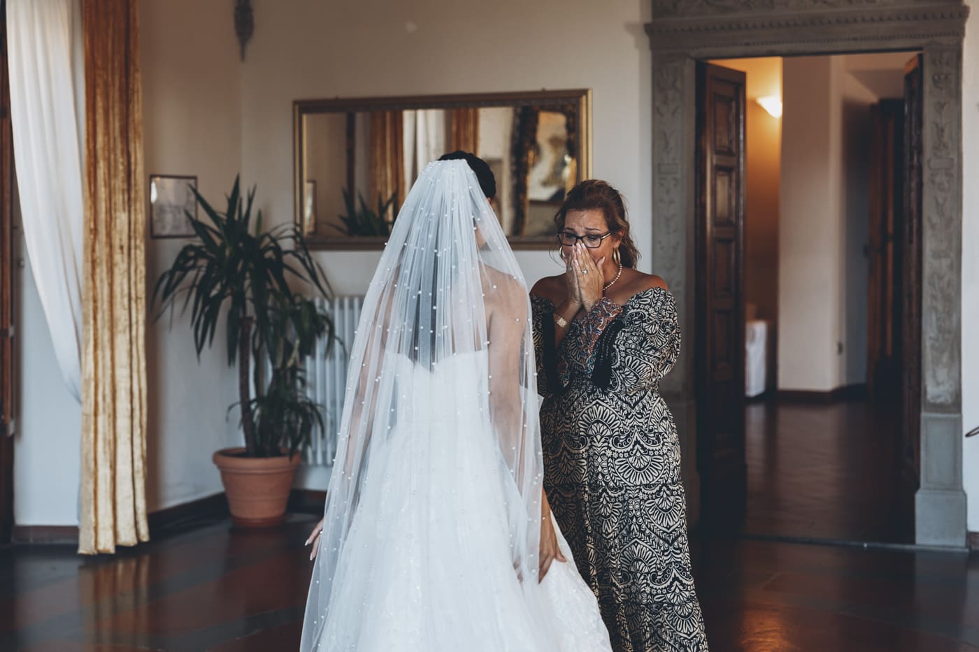
The Emotional Side of Editing: When the Work Hits Home
Every now and then, a photograph stops me in my tracks as I edit. Maybe it’s a father trying to hold back tears, a child curling up in someone’s arms during vows, or the quiet moment when two people glance at one another and everything around them fades. These images don’t always announce themselves in the RAW files, but once I start working on them, something shifts.
I slow down.
I breathe.
I make the smallest adjustments, waiting for the emotion to come forward.
Enhancing Emotion


This quiet moment of a bride gazing at the sea from her hotel balcony captures one of those fleeting, contemplative pauses before the ceremony begins. Taken from behind during golden hour, the original image held inherent emotion, but the editing process was designed to amplify and reveal the feelings beneath the surface.
By emulating a warm film stock with its characteristic softness and subtle grain, the image gains an intimate, nostalgic quality that enhances the reflective mood of the moment. The gentle film aesthetic creates emotional distance and timelessness—as if we're witnessing a cherished memory rather than just a photograph. The warm tones amplify the golden light's romantic glow, while the organic texture of film grain adds a tactile, human quality that draws viewers deeper into her private moment of anticipation and wonder.
There are times when I spend longer on a single frame than on an entire sequence — not because it’s complicated, but because it asks for care. Editing can be technical, yes, but moments like these remind me that the heart of the process is deeply, unmistakably human.
Conclusion: More Than Just Editing
Post-processing isn’t a correction; it’s a continuation of storytelling. It’s the place where the photograph stops being a record of what happened and becomes a reflection of how it felt. Whether I’m softening highlights to echo the warmth of the moment, refining a skin tone until it feels natural, or shaping a color grade inspired by my love of film, every choice is rooted in emotion and intention.
Weddings pass quickly. Editing is where I slow them down and give them permanence. It’s where memories are crystallized and given the dignity they deserve. At its best, post-processing is not routine — it’s care. It’s gratitude. It’s love.
Let’s Tell Your Story: Beautifully and Authentically
If you’ve made it this far, thank you. That means you care not just about having your wedding documented, but about how it’s translated into art. If that resonates with you — if you’re looking for a wedding photographer who treats editing as an essential, thoughtful part of the creative process — I’d love to talk.
You bring the love, the light, the laughter.
I’ll bring the eye, the experience, and the care to turn it all into something truly timeless.
Let’s connect about your wedding day.
Or simply browse my wedding photography packages to learn more about what’s included — and how your story will be told.
